Python Data Analysis

Exploratory Data Analysis

Python is a favorite language and development environment for Data Scientists.  Here, the Argus Project is working on developing and describing a Python environment for processing Argus based network flow data.  Structured as a set of libraries, programs, workflows and processes, we aim to provide a way to analyze any network flow data, imported as Argus flow data, process it using Python.  Where possible, the Argus Project will use Python community projects as its starting point, focusing on Python, Anaconda, and Pandas.

In these examples, we'll touch on the principal features of a Python based ML workflow.  First, we need to startup python ...

Start Python

For most of these examples, we'll use Python 3.8.0 on Mac OS X Catalina.  No particular reason, other than the Mac is my primary development system.

apophis:~ carter$ python3
Python 3.8.0 (v3.8.0:fa919fdf25, Oct 14 2019, 10:23:27) 
[Clang 6.0 (clang-600.0.57)] on darwin
Type "help", "copyright", "credits" or "license" for more information.

>>>

Import the Necessary Packages

This will work great, if the packages are installed on your system. Errors like 'ModuleNotFoundError' will give away that they aren't installed correctly.

import numpy as np
import pandas as pd
import matplotlib.pyplot as plt
from pandas.plotting import scatter_matrix

Import the Data to Pandas

## Read CSV Argus data from a file

filename = "argus-output.csv"
df = pd.read_csv(filename)


Check the Data Import

Argus data import fields are specified when you generate the Argus data CSV.  Columns, column order, format are all unstructured, in that you can define as many as you want, and import as much as is useful.  A little parsimony goes a long way in data import processing times, so import what you need, especially when working with millions of rows of data.

Column names are specific to Argus, but can be modified in the CSV, prior to import.  Names are very important as they are referenced in almost all the next steps in this example.

## The shape is the number for rows and columns
print(df.shape)

(4953136, 11)

print(df.head(5)))

StartTime Flgs Proto SrcAddr Sport Dir DstAddr Dport TotPkts TotBytes State 0 1.571803e+09 e udp 192.168.0.203 59805 -> 192.168.0.1 53 1 85 INT 1 1.571803e+09 e udp 192.168.0.203 59805 -> 192.168.0.1 53 1 85 INT 2 1.571803e+09 e tcp 192.168.0.203 41888 -> 204.12.217.19 80 1 74 REQ 3 1.571803e+09 e udp 192.168.0.150 13470 -> 192.168.0.1 53 1 88 INT 4 1.571803e+09 e arp 192.168.0.154 who 192.168.0.109 1 60 INT

Begin Exploring

Once the data is imported into Pandas, there really isn't any limitation to what you can do with the data.

These examples are here for illustration, and don't mean to guide the Data Scientist into a specific set of data elements that are more important than others.

## Get Unique Destination Ports
print(df["Dport"].unique())

['53''80' ... '16560''50563'57716']
## Get Distinct Destination Addresses with count
print(df.groupby("DstAddr").size())

DstAddr 0.0.0.1 3833 0.0.0.2 92 ... ff15::efc0:988f 3780 ff:ff:ff:ff:ff:ff 759 Length: 19393, dtype: int64

Visualize the Data

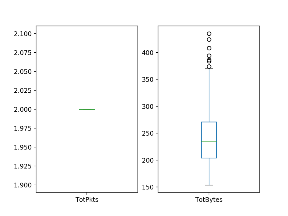
Box and Whisker plots (box plots, for short) are an exploratory visualization technique that show range and distribution of a single variable.  The middle line indicates the median of the distribution. The top and bottom sides of the box indicate the 75th and 25th percentiles of the data distribution.  And the whiskers show 1.5 times the Interquartile Range (IQR) which is the 75th percentile minus the 25th percentile.  Outliers are shown as points outside the whiskers.   For DNS queries, flows are limited to two packets (a request and a response), but can vary in the number of bytes in each flow.

## Plot Box Plots
dns = df[df["Dport"] == "53"]
dns[["TotPkts","TotBytes"]].plot(kind='box',subplots=True,layout=(1,2),sharex=False,sharey=False)
plt.show()


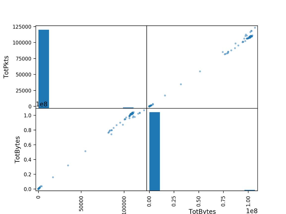
A Scatter matrix is another form of exploratory data visualization that shows the distribution of each variable on the diagonal axis and the correlation between the variables in the off-diagonal spaces.  As expected, bytes and packets for a flow are highly correlated.

## Plot a Scatter Matrix
scatter_matrix(df[["TotPkts", "TotBytes"]])
plt.show()
© Copyright QoSient, LLC.
All Rights Reserved.
site by spliteye